A Fount of Fonts

Great article from Steven Heller, a former art director at The New York Times and a co-chair of the MFA Design Department at the School of Visual Arts.

The computer has put the word “font” into common parlance as a synonym for typeface. But ask most people, even many young graphic designers, where the word comes from, and blank stares abound. (For the record, it’s from the 16th-century French word fonte, which is derived from fonder, or “to melt,” and denotes the action or process of casting or founding.)

That is why for the past two years I have made a pilgrimage, with School of Visual Arts students, to Cornuda, Italy, a village about 40 miles north of Venice, near the Palladio-designed Villa Barbaro, to the Tipoteca, a museum devoted to the history of letterpress printing and typefaces, or fonts.

Read more


Creating Coasters (and Fighting Piranhas)

Mike Dacey a.k.a. Repeat Press of Somerville, MA created some sweet custom coasters.  Check out his intricate process from beginning to end and listen to Jack White play the blues.  Some might print as well, but few can make it look cooler.

Video by: iloveqp.com                         Music:  "I Fought Piranhas" by The White Stripes

Repeat Press is a letterpress studio located within The Fringe Movement in Union Square, Somerville. Since I started printing rock posters in 2003, Repeat Press has grown from a small corner of a college art building to a full-scale studio specializing in contemporary custom letterpress printing.

Book Making & Letterpress Printing Workshops

Our friends at Purgatory Pie Press, Esther K. Smith and Dikko Faust, will be in Portland and Seattle next week conducting two workshops: Instant Art Books and Experimental Letterpress Printing.  The four day workshops in Portland at the Pacific Northwest College of Art begin on August 9th and offer a rare opportunity to learn from these masters. 

Esther's class demonstrates some easy basics of creative bookbinding, exploring simple stitched and folded bookbinding from Eastern and Early Western traditions.  Dikko's workshop explores letterpress printing in ways that you never thought possible.  These workshops are guaranteed to please. 

For more information, and to register, please click here.

Jessica Hische Loves Letters

Brooklyn (by way of Philly) designer/illustartor/typographer/artist Jessica Hische came on our radar this week via her Drop Cap Project. In her words:

Daily Drop Cap is a project I started in September of 2009 in which I illustrate a decorative letter every day (or at least every work day). The project will continue for approximately twelve alphabets and are available for non-commercial use as drop caps on your personal blog.

She also made limited edition 8x8 letterpress prints of each letter for sale individually or as a set.  (If you buy the whole set she'll send you a cake as well!)  They're currently on display at Art in the Age in Philadelphia.

Only a few years removed from art school, she's already very accomplished - she was featured as one of Step Magazine’s 25 Emerging Artists, Communication Arts “Fresh”, Print Magazine’s New Visual Artists 2009 (commonly referred to as Print’s 20 under 30), and The Art Directors Club Young Guns.

Here's a short look into Jessica and the project:


Legion Bamboo featured in Paper Specs

This month's edition of Paper Specs included a feature on Legion Bamboo titled "The Score:  Bamboo 1, Landfill 0".  

Here's the first paragraph.  Read the rest here.

As designers, we are always looking for new and unique ways of expressing ourselves, whether it’s in the form of a thank you letter, wedding invitation, annual report or product packaging.  The challenge is to find something that is not only different, but is at the forefront of a trend. It was about this time last year that the folks at Legion Paper were posed with such a challenge by their customers: “We want a deluxe paper that is eco-friendly, but speck-free; natural, but luxurious; accepts all forms of printing, and while you’re at it throw in a complete line of matching envelopes.” The result was Legion Bamboo, and there’s nothing else like this on the market....

Read the rest of the article

Album Art in the Age of Digital

You remember those old LP's?  The beauty of records was the huge 12" canvas for artists to display their work.  With the advent of CD's, album art shrank to just under 5".  Now with iTunes, cover art is measured in pixels (200x200). 

Occasionally, there are still some musicians who release their music on limited edition LP's.  Since this is such a rare occurrence these days, the artists commissioned to design the covers produce masterpieces in their own right.

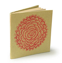
Take for example this gorgeous packaging design for Douglas Quin’s Fathom LP.  The cover art and liner notes are custom letterpress printed in limited editions of 1000.  I miss my old record collection.

Somerset and Horkey

A selection of Aaron Horkey's illustrations will be letterpress printed on Somerset Velvet Radiant White 330 gsm fine art paper and produced to the exacting standards of Master Printer, Gerald Lange of The Bieler Press. 

High resolution digital scan backs were taken of the original drawings to capture their intricate detail and to provide accurate rendering for the letterpress process. The proofs were printed from steel-backed photopolymer plates on dampened Somerset Velvet Radiant White mouldmade paper.

Beginning on the 18th of July, Dead Arts Publishing will be releasing Suite 1 of this 6 part series featuring exact scale reproductions of a selection of illustrations from Aaron's body of work to date.

Click here for more information

Disappearing acts: Printing with letterpress

The UK's Guardian put together a great video on letterpress printing featuring London's Hand and Eye Letterpress.  

Hand and Eye was formed in 1985 by Phil Abel and has done a great assortment of work including posters and books (they are one of the printers of The Letterpress Shakespeare for The Folio Society.)  Most of their featured work is done on Somerset and Zerkall papers.

Check out the video

The Great Oil Leak Poster Project

While we all sit helplessly and watch this disaster unfold, a few designers/artists from Louisiana are doing their small part to help.  

Their curated poster contest was created with the aim of collecting donations, and selling prints, to have funds to donate to the local fishermen who are drastically affected by this spill.  

They've lined up shows throughout the region and are expanding to other areas.  As for what to submit, they said it best:

"We will take any poster that you send. Screened on a 5 inch by 7 inch box of cereal? Perfect. 50 self-published offset lithographs? Love to take them. Letterpress, silkscreen? Excellent. Point being, we not only want your work, we want your best work."  Submissions are due by June 19.  More information.

Briar Press

We're sure this isn't news to many of you, but for those who aren't familiar with Briar Press, it's a great resource.  As they say "Briar Press is a community of letterpress printers, book artists, and press enthusiasts. The site is dedicated to the preservation of letterpress-era equipment and the art of fine printing."

In addition to their always interesting discussion groups, they have a wonderful image gallery of old letterpress printers, free vector files to use in your designs and a forthcoming museum that will include a virtual collection of presses and pin marks. 

Let {her} Press

The creative women of Let{her} Press - a collective of five women-run letterpress companies from across the country - took the leap and displayed together at the May 2010 NSS show in New York. 

It is rare occasion where a grouping of companies can display designs together and still have each stand out on its own merits.  The members of the group are BirdDog Press (Colorado),  Lucky Bee Press (California), Paper Parasol (Chicago), Paper Stories (Grayslake, IL), and Robin Beth (NJ).

We have had the opportunity to work with several of these women over the years supplying a variety of papers including Lettra, Legion Bamboo, Arturo, Stardream, and Sorbet, to name a few.

Learn more about the work these talented women are doing.

Arion Press

We've been fortunate enough to have worked with Arion Press for as long as we've been in business.  They're one of the world's top printers of fine books and if you're interested in letterpress (and you probably wouldn't be reading this if you aren't) you should know who they are.

The list of artists who've collaborated with them over the years is a who's who of the industry and their editions are collected by individuals, museums and libraries the world over.  You can find more about that here.

You may not be as familiar with two of their other divisions:  Their typecasting division, M & H Type, is the oldest and largest hot metal type foundry in the U.S. for letterpress printers.  They also have a non-profit called The Grabhorn Institute"to preserve and perpetuate the use of one of the last integrated typefoundry, letterpress printing, and bookbinding facilities and to guide it into the future."

We're proud to say that they've used many of our papers including Somerset, Arches, Lettra and Arturo.

If you're in San Francisco, stop by for a tour or to visit their gallery.  If you're not local you can check out a series of videos about them and their work.


New site launched, people rejoice

Welcome aboard.  We hope you like the new site.  We're going to use the blog to feature a lot of the cool and interesting work done on our papers, new papers, new trends - pretty much anything we find interesting. ( If you'd like your work to be considered, please let us know.)

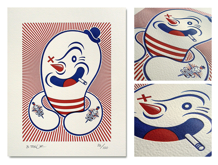
Special thanks to Fresh Impression Letterpress Studio for help with much of the artwork.  So to start off, here's a recent project they did on Lettra.