Don Kilpatrick
/Here's a great video of Don Kilpatrick, of the College for Creative Studies, showing his printing process.
Here's a great video of Don Kilpatrick, of the College for Creative Studies, showing his printing process.
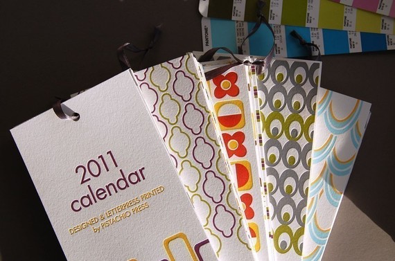 We know, we know. There must be 100 blogs dishing about their favorite 2011 calendars. We're not going to join in with a big list of our own (though check these out if you want) but here's one we thought was pretty cool and unique from Pistachio Press.
 Not much else to say other than "why didn't I think of that"?
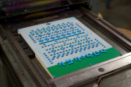
More here on this work by Justin LaRosa andSamuel Cox
Brooklyn-based husband and wife team Maggie Campbell and Matt Raw have been churning out gorgeous letterpress creations for just a few years but have already become favorites of ours. Maggie's been studying bookbinding for over 15 years but only recently took her gig full time.
Their recently created 2011 calendars are gorgeous. Of the one shown to the right, they say: 
From the binding, to the handwritten lettering, to the intricate vine drawings in the background, this was a labor of love, from start to finish. Each calendar is covered with Japanese silkscreened paper (a.k.a. chiyogami) and bound by hand in a Coptic stitch (knotted, visible stitching that lies flat when open) with waxed chocolate brown Irish linen thread.
With one month per page, 2 blank pages follow every 2 months (perfect for making notes of birthdays, holidays, appointments, etc.). The background of the pages features different sections of a drawing of Maggie's: a delicate and intricate layered pattern of vines, printed in two soft tones of yellow-y, spring green. The handwritten months are laid over the green background in a chocolate brown ink, and the entire piece was letterpress printed by hand on heavy, soft white [Legion] bamboo stock.
Dan Wood has been a favorite of ours for years and this print is part of the reason why.
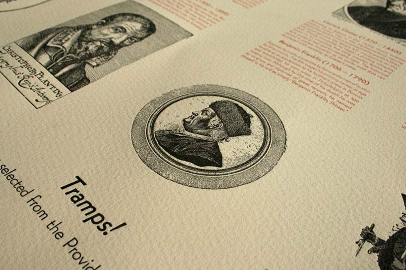 "Tramps! A Miscellany of Printers Portraits", by Dan Wood and Katherine Cummings, is a two color letterpress print from polymer plates, with the title hand-set in Bernhard Gothic lead type. Using images selected from the hundreds of recently scanned printers portraits at the Daniel Berkeley Updike HIstory of Printing Collection in the Providence Public Library, the print focuses on early printers of the 15th and 16th centuries, with Benjamin Franklin and a few other later eccentrics thrown in for good measure
Dan and Katherine used Somerset Textured 300gsm softwhite for this project.
A portion of the sale of this artwork will be donated to the Daniel Berkeley Updike History of Printing Collection at the Providence Public Library Special Collections.
Mike Dacey a.k.a. Repeat Press of Somerville, MA created some sweet custom coasters. Check out his intricate process from beginning to end and listen to Jack White play the blues. Some might print as well, but few can make it look cooler.
Video by: iloveqp.com Music: "I Fought Piranhas" by The White Stripes
Repeat Press is a letterpress studio located within The Fringe Movement in Union Square, Somerville. Since I started printing rock posters in 2003, Repeat Press has grown from a small corner of a college art building to a full-scale studio specializing in contemporary custom letterpress printing.
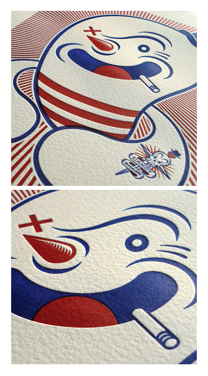 Click to enlargeBrian Taylor of Candykiller made a series of six, ahem, killer letterpress prints. Check out the three most recent prints (one, two, three) as well as his "Coney Letterpress Print".
The prints are done on Somerset Textured 300gsm mouldmade paper.
Brooklyn (by way of Philly) designer/illustartor/typographer/artist Jessica Hische came on our radar this week via her Drop Cap Project. In her words:
Daily Drop Cap is a project I started in September of 2009 in which I illustrate a decorative letter every day (or at least every work day). The project will continue for approximately twelve alphabets and are available for non-commercial use as drop caps on your personal blog.
She also made limited edition 8x8 letterpress prints of each letter for sale individually or as a set. (If you buy the whole set she'll send you a cake as well!) They're currently on display at Art in the Age in Philadelphia.
Only a few years removed from art school, she's already very accomplished - she was featured as one of Step Magazine’s 25 Emerging Artists, Communication Arts “Fresh”, Print Magazine’s New Visual Artists 2009 (commonly referred to as Print’s 20 under 30), and The Art Directors Club Young Guns.
Here's a short look into Jessica and the project:
The UK's Guardian put together a great video on letterpress printing featuring London's Hand and Eye Letterpress.
Hand and Eye was formed in 1985 by Phil Abel and has done a great assortment of work including posters and books (they are one of the printers of The Letterpress Shakespeare for The Folio Society.) Most of their featured work is done on Somerset and Zerkall papers.
Check out the video
 Welcome aboard. We hope you like the new site. We're going to use the blog to feature a lot of the cool and interesting work done on our papers, new papers, new trends - pretty much anything we find interesting. ( If you'd like your work to be considered, please let us know.)
Special thanks to Fresh Impression Letterpress Studio for help with much of the artwork. So to start off, here's a recent project they did on Lettra.

We're happy to provide you with recommendations, help solve any paper-related issues or help you design your own paper.

We’re happy to provide you with recommendations, help solve any paper-related issues or help you design your own paper. Ask an expert >

Getting the exact size paper you need is a process that requires skill and experience to assure a quality cut every time. We offer worry free paper cutting to the size you need. Read More >
See and feel the paper for yourself! We have a huge sample library with over 3,000 different papers. Go to sample library >
Copyright © 2014-forever. Letterpress Paper.
All rights reserved. Site by CR


